There is more to a Personal Colour Analysis than meets the eye.
Understanding the history of colour, what is a ‘Personal Colour Analysis’ and why it matters.
Colour plays a vital role in our lives and how we respond to our surroundings, each other and ourselves. Its impact is immediate, powerful and transformative. A colour analysis is a great investment in you and your wardrobe; if you look and feel great, others will respond to you in a much more positive manner. And you will feel more positive too. But there’s a whole lot more involved when it comes to assessing an individual’s unique colour direction…
Did you know, for example, that your personal colour changes as you age? That is why it is recommended to have ‘your colours’ analysed at least once every ten years. So, what exactly is a ‘Personal Colour Analysis’?
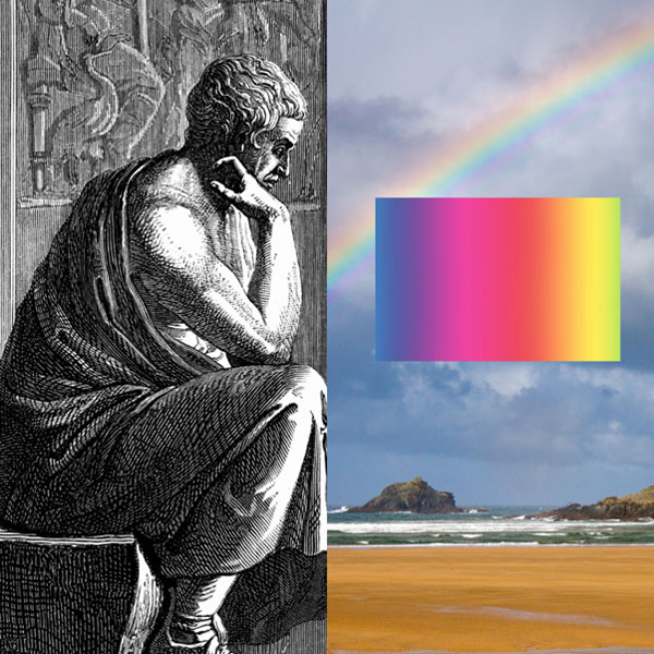
To explain, I am going to give you a brief historical overview. Colour and the perception of colour has been approached throughout history by scientists, philosophers and artists alike. Aristotle (384 BC -322 BC) proposed one of the first theories about colour suggesting that colour ‘was sent to God from heaven through celestial rays of light.” (Reinten 2018) I love this visual image because it connotes the magical and influential nature of colour. Aristotle suggested all colours came from white and black (lightness and darkness) and he related them to the four elements of water, air, earth and fire. In the 1660’s, English physicist and mathematician Isaac Newton (1643 -1727) discovered the physics of the rainbow after experimenting with sunlight and prisms. He demonstrated that clear white light was composed of seven visible colours, called a ‘spectrum’ (red, orange, yellow, green, blue, indigo and violet). Newton was also the first to map the colours in a circular diagram. He discovered that secondary colours could be made by mixing primary colours and showed this via creating what we now know as a ‘colour wheel’.
It was after Newton’s publications that artist and philosopher, Johann Wolfgang von Goethe, (1749-1832) challenged Newton’s views arguing that colour was not simply a scientific measurement but a subjective experience perceived differently by each viewer. He went on to promote the psychological influences of colour, “Colours are light’s suffering and joy.” (Smithsonian 2020) I think it would be fair to say that wearing a bright yellow or fuchsia top can promote a very different mood compared to wearing a dark ink navy, or black shirt. Think about how your mood is affected by the colour of the sky at dusk or sunrise – the power and energy of colour is indeed fascinating; Goethe was definitely on to something.
The first person to classify colours was Albert Henry Munsell (1858 – 1918). He organised colours according to their hue, value and chroma. Value is the lightness or darkness of a colour and chroma is the intensity of a colour. Remember these attributes because it is highly relevant to the work that skilled colour consultants do today.
Other key colour and art theorists who have contributed to the understanding and perception of colour include Johannes Itten (1888-1967) and Robert C Dorr (1905-1979). Itten was an expressionist painter who examined the contrast between cool (blue based) and warm colours (yellow based). He also divided these into light and dark. The designation of certain colours as warm, and others as cool, persists to this day. Itten also associated colours with four types of people and four harmonised groups of colours (Spring =warm and light, Autumn = warm and dark, Summer = cool and light, Winter = cool and dark). (Reinten 2018) He further recognised the evocative emotional reaction that people had to colours; ‘green with envy’, ‘seeing red’ and ‘feeling blue’ are examples of this. (House of Colour 2019) Certain combinations of colours can be more pleasing than others and harmonious colours can positively influence our emotions and the environment. For example, “how would you feel if you saw a police officer dressed from head to toe in a bright yellow suit, or a nurse dressed in sombre brown?” (House of Colour 2019) Itten expressed that “Colour is life” (Smith 2019) and we all know that colours have strong symbolic connotations that affect how we look, feel and react. Without colour, life would be very dull indeed.

Aristotle’s ‘rays of light’ and Newton’s’ ‘physics of the rainbow’

The psychological impact of colour is powerful and can affect the way we feel and how others react to us
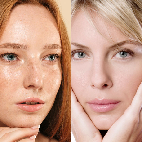
“The advent of colour in the film and television industry in the 1940’s brought about an interest in the effects of colour on their appearance. Dorr, an artist who knew of Itten’s theories of colour groupings, observed how an actress could look wonderful one day, yet tired and older another; he recognised this was the effect of the colour she was wearing on her skin.” (House of Colour 2019) Dorr began working as a colour consultant for cosmetics companies further developing his understanding of the colour of skin tone. The base colour of skin, or ‘undertone’, can be tinged slightly blue or yellow, while the surface colour is known as the ‘overtone’ and these differences in skin tone can change from person to person. Dorr saw that in the case of a personal colour analysis, the individual becomes the background for the colour – all colour that is placed on the human body either harmonises, complements or competes with the client’s natural colouring. This was the birth of the ‘image consultant’ – a professional expert trained to help real people wanting to know the answer to: ‘how can I look good?’, ‘how do I know what colours suit me?’ and, ‘how do I create an image to suit my lifestyle?’.
Dorr created the first Colour Key System which focused on relative temperature. There are cool and warm forms of every colour (with the exception of orange which only sits on the warm side). For example, there can be a warm version of yellow like the rich colour of gold, compared to a cooler lemon hue. If you have a cool undertone, you are best to wear a cooler version of yellow. This means that most people can wear a colour from their opposite direction, but it must include the correct relative temperature that is harmonious with their particular skin undertone and other physical characteristics.
Personal Colour Analysis Systems started to develop at this period in history and peaked in the 1970’s and 80’s. Suzanne Caygill (1911-1994) was an American fashion designer and colour theorist who developed the Caygill Method of Colour Analysis creating individual style guides and colour palettes for clients and teaching design seminars. Some of you may remember back to the 1980’s when the very well-known book, ‘Color Me Beautiful’ by Carol Jackson, became a pop-culture phenomenon. (Reinten 2019) Jackson simplified colour analysis into four different seasons, also known as ‘seasonal analysis’. Her technique placed an individual’s colouring into the groupings of Winter, Spring, Summer and Autumn and allowed them to choose their best thirty shades. However, while this system worked for many people, some considered it too limiting not taking into consideration that a person’s colouring changes according to their age, health and other lifestyle factors like simply changing hair colour.
So, Diane Pooser (1943 -) who worked with Jackson, refined the original four seasonal groupings into the twelve directional seasons system. In the 1990’s most colour companies adjusted their colour analysis determination to allow for the Directional Colour Theory. (Reinten 2018) This system is very comprehensive and widely used today. Directional Colour Theory recognises that colour is based on temperature, value and intensity.
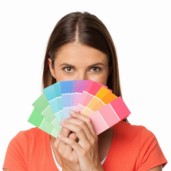
The aim of a colour consultant is to determine the range of colours, values, intensities and contrasts that are most flattering for a client. (Reinten 2018) When we wear the colours that suit us the most, our whole appearance is enhanced.

Itten’s designation of warm and cool colours was further developed by Dorr in his study of skin colour and the variance in warm and cool undertones and overtones

A Personal Colour Analysis has many benefits that can save you time and money
In summary, here are my top ten reasons why a Personal Colour Analysis is such a worthwhile investment:
- Without a doubt, when you wear your best range of colours, you will look more vibrant, fresh-faced, healthier and attractive.
- Discover your signature colour(s). This is a stand out colour that will look ‘wow’ on you and one you should invest in especially if you are selecting an outfit for a special event, or wish to make a statement.
- When you know your unique colour direction, you will also understand the best contrast value of colours to wear; this is critical when co-ordinating your wardrobe items and creating wardrobe clusters (a group of clothing items that work well with each other.) Different colour contrasts will also influence the way others perceive you.
- Your specific colour direction is closely correlated to particular types of prints and patterns that naturally suit you from stripes and spots to florals and geometric designs. Knowing your best contrast level will help you shop for print designs with the correct proportion of colours that suit your unique complexion.
- Your personal colour analysis will reveal the best fabrics for you to wear. The fibre, texture and surface of a garment will alter the effect of a colour; some fabrics reflect light more easily and others may create shadows that deepen a colour. All these intricacies will affect the suitability of particular fabrics in relation to your personal colour ID.
- Learn how to style your colours and find out which styling strategies can be used in order to help you look taller, slimmer, shorter or larger.
- You will work out the best colours for your eye makeup, hair colour and accessories to create a harmonious look.
- Be psychologically impacted by the power of colour to change your mood.
- Find out the best colours that harmonise with your personality and that will support how you would like to be received by others in certain situations – like a romantic date or job interview.
- You will become more confident when shopping for clothing, makeup and accessories because you will be more in tune with what colours work best for you. This will make you a more conscious consumer and save you time and money in the long term. As Aristotle stated, “Knowing yourself is the beginning of all wisdom.”
References
House of Colour, 2019, History, viewed 15 March 2020, <https://www.houseofcolour.co.uk/history>
Reinten, Ann 2018, Advanced Multi Racial Colour Analysis, Victoria, Image Innovators Pty Ltd
Smith, Kate, 2019, Sensational Colour, viewed 15 March 2020, <https://www.sensationalcolor.com/color-quote-graphics/>
Smithsonian Libraries, The Science of Colour, viewed 15 March 2020, <https://library.si.edu/exhibition/color-in-a-new-light/science>
